NetCDF and imaging arrays 
Introduction
This notebook exercise involves import of NetCDF format 2D data, and plotting that data firstly as an image, then as a 3D surface, exploring the range of colour palettes available in matplotlib.
- NetCDF: project home
matplotlib: online documentation
You will import self-describing 2D array data in NetCDF format, using the scipy Python libraries. You will use matplotlib to display the data as an image (or heatmap) with a range of colour palettes, to investigate how the use of colour can aid or hinder interpretation. Finally, you will render 2D array data as a 3D surface plot, and explore how to use matplotlib's 3D axes and lighting effects to display your data more effectively.
Python imports
The code in the cell below suppresses noisy warnings from some of the matplotlib plotting functions.
import warnings
warnings.filterwarnings('ignore')
Learning Outcomes
- Read and use NetCDF format data using Python
- Visualise array data as a heatmap/image
- Explore array data visualisation with a range of colour palettes, and understand how selection and normalisation of colour palettes can influence the interpretation of data
- Visualise 2D array data as a 3D surface plot
- Explore the application and influence of colour palettes and lighting effects on the interpretation of 3D surface plots
Exercise
1. Reading NetCDF data
Introduction
You are being provided data in NetCDF (Network Common Data Format) form. The term NetCDF refers both to the data format itself, and the set of software libraries that read and write the data. The aim of this set of libraries and formats is to allow for better exchange of self-describing, array-oriented data. You can read more about this endeavour at the links below:
NetCDF links
As part of the exercise is to see how effective use of colour palettes can be a hindrance as well as a help to interpretation of datasets, the identity and origin of the dataset will not be disclosed directly in this text (but you'll probably work it out quite quickly, anyway).
The data is a 1121x1141 xy grid, each having a single z data point: i.e. a standard two-dimensional array.
Python imports
The SciPy module for working with NetCDF data is scipy.io.netcdf, and can be loaded with:
from scipy.io import netcdf
# Import SciPy's netcdf module
from scipy.io import netcdf
Data location
The input NetCDF data is in the repository's data directory, with the name GMRTv3_2_20160710CF.grd. For convenience, this location is assigned to the variable infile in the cell below.
infile = "../../data/GMRTv3_2_20160710CF.grd"
# Define the location of the input NetCDF4 data
The NetCDF file at the location indicated by infile can then be read in to the variable dataset using the netcdf module's netcdf_file() function:
data = netcdf.netcdf_file(infile, 'r')
SciPy'snetcdfmodule reference: link
# Load the NetCDF dataset as the variable `dataset`
All NetCDF variables are contained in the .variables attribute of the dataset:
dataset.variables
This is accessed like any other dictionary:
dataset.variables['lat']
# Inspect the dataset's variables
The self-describing nature of NetCDF is visible in SciPy. For example, the imported dataset has a .history attribute, and each variable has .units attribute, that can be accessed readily. These attributes contain bytes data, rather than raw strings, so need to be decoded in UTF-8:
print(dataset.history.decode("utf-8"))
print(dataset.variables['lon'].units.decode("utf-8"))
# Inspect the dataset's history, and variable units
Working with the imported data directly, you need to be aware that this is the scipy.io.netcdf.netcdf_variable datatype. In keeping with the NetCDF philosophy, this datatype provides self-descriptive information.
type(dataset.variables['altitude'])
dataset.variables['altitude'].__dict__
# Inspect the dataset's variable datatype
Some operations that you might expect to work for a NumPy array are not available for the netcdf_variable object, but the underlying object in the .data attribute is a standard numpy.ndarray, and this can often be used directly.
2. Visualising NetCDF/array data as an image
Introduction
The NetCDF data we have loaded contains the variable altitude, which is a 1121x1143 array of float64 values. This data format is compatible with the most common base graphics library in Python: matplotlib, and we can represent this data directly without further modification.
matplotlib: http://matplotlib.org/
matplotlib is one component in the pylab/SciPy enterprise: an attempt to make Python an environment for scientific computing at least as powerful as commercial alternatives, such as MatLab. The Jupyter notebook we are using provides magics which allow for integration of these tools into the notebook as though we were using, for example, the MatLab IDE.
For the rest of this exercise, we will use the notebook with the following magic:
%pylab inline
%pylab by itself would enable all the functions of SciPy/NumPy/matplotlib, but by using the additional argument inline, we are also able to render graphical output directly within the notebook.
# Run the pylab magic in this cell.
%matplotlib inline

import matplotlib.pyplot as plt
import matplotlib as mpl

import numpy as np
Visualising array data
The simplest way to display 2D array data is as an image (this is how uncompressed image data is often stored). This treats the array as pixels, where each cell value relates to some representative aspect of the pixel, such as greyscale intensity, or luminance.
- Image file formats: Wikipedia
matplotlibcolormap reference: http://matplotlib.org/examples/color/colormaps_reference.html
To represent array data as an image, matplotlib provides the function imshow() (now available in cells due to the %pylab magic). You can find out more about this function by inspecting its help documentation in the cell below, using:
help(imshow)
# Use this cell to obtain help for the imshow() function
#help(imshow)
You can obtain a default image representation of the data in data.variables['altitude'] using imshow() - and an accompanying colorbar to aid interpretation - with:
plt.imshow(data.variables['altitude'].data, origin='lower')
plt.colorbar()
# Use imshow() to produce a default representation of data['altitude']
By default, prior to V2.0, matplotlib used the colormap rainbow. Before this, the rainbow colormap was used. We can see how this image would appear in earlier versions of matplotlib, by specifying the colormap 'rainbow' when we call imshow():
plt.imshow(data.variables['altitude'].data, origin='lower', cmap='rainbow')
# Display the image using the 'viridis' colormap
QUESTION: Now that it should be obvious what the dataset represents, do you think these two default colourschemes deliver insight or meaningful representation of the data? And, if not, why not?
3. Colormaps
Introduction
The purpose of a colormap is to represent values of your dataset in 3D colour space. The difficult part is finding a suitable mapping that represents your data well and either provides insight into your dataset, or helps communicate an aspect of your dataset to the reader.
There is no universally 'best' colormap, but answering some questions about your data may help you choose a suitable colormap:
- Are you representing continuous or categorical data? (e.g. dominant organism vs. extent of diversity)
- Is there a critical value from which other values deviate, that should be highlighted? (e.g. house price threshold)
- Is there an intuitive colour scheme for what you are plotting? (e.g. green for land, blue for sea; political party colours)
- Is there a standard for this kind of plot, which the reader will expect? (e.g. topological colouring)
- Why should engineers and scientists be worried about colour? link
Classes of colormap
Colormaps can be split into four main classes, all of which have representatives in matplotlib:
- Sequential
- Diverging
- Qualitative
- Miscellaneous
Sequential colormaps increase monotonically in lightness, progressing from low to high values. This is helpful, as humans perceive changes in lightness more easily than differences in hue (colour). Where this difference in lightness is perceptually uniform, equal changes in lightness represent equal changes in data value.
For these colormaps, lighter pixels have higher values
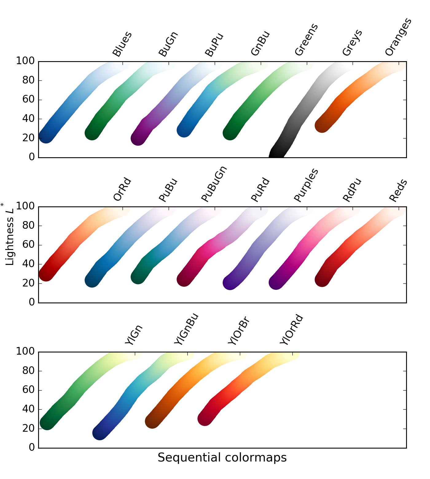
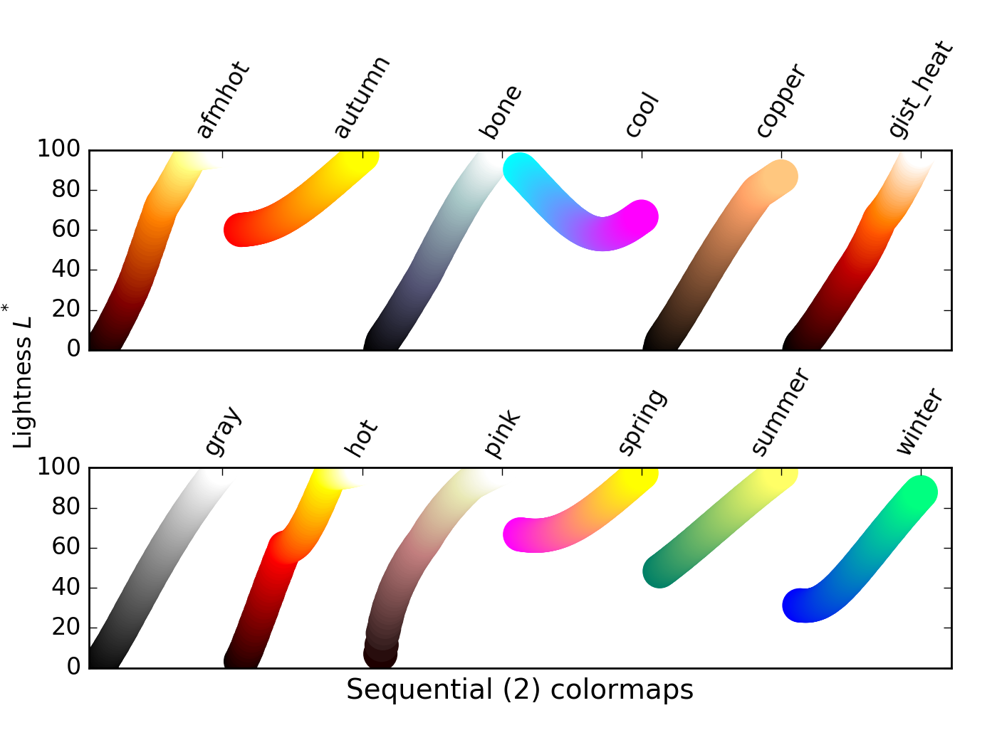
There is a class of sequential colormaps whose change in lightness is not monotonic, but can plateau (same lightness, change in hue), or even vary up and down. These colormaps can result in the reader perceiving a banding in the image that does not reflect properties of the data, as lightness does not change along with the data values.
For these colormaps, visible banding effects may not represent a meaninful similarity between datapoints
- Discussion of banding effects: link
# Helper function to render comparative subplot images
# Use this in the cells below to inspect the effects of changing colormaps

# Required to place colorbar scales in the subplot
# see, e.g.
# http://stackoverflow.com/questions/18266642/multiple-imshow-subplots-each-with-colorbar
from mpl_toolkits.axes_grid1 import make_axes_locatable

# Function to render data with a range of colormaps
def compare_colormaps(data, cmaps):
    """Renders the passed array data using each of the passed colormaps

    - data: array-like object that can be rendered with imshow()
    - cmaps: iterable of matplotlib colormap names

    Produces a matplotlib Figure showing the passed array-like data,
    rendered using each colormap in cmaps, with an associated colorbar
    scale.
    """
    # Create n x 3 subplots, ready to render data
    nrows = 1 + (len(cmaps) // 3)  # // is integer division
    if not len(cmaps) % 3:  # Correct number of rows for multiples of 3
        nrows -= 1
    fig, axes = plt.subplots(nrows=nrows, ncols=3, figsize=(15, nrows * 5))
    plt.subplots_adjust(wspace=0.3, hspace=0.1)  # Allow space for colorbar scales

    # Create one subplot per colormap
    for idx, cmap in enumerate(cmaps):
        # cm.cmap_d contains a dictionary of allowed colormaps
        assert cmap in plt.cm.cmap_d, "colormap %s is not recognised" % cmap
        # Identify the axis to draw on
        row, col = (idx // 3, idx % 3)
        if len(cmaps) > 3:
            ax = axes[row][col]
        else:
            ax = axes[col]
        # Draw data
        img = ax.imshow(data, origin='lower', cmap=cmap)
        ax.set_title(cmap)  # set plot title
        # Draw a colorbar scale next to the image data
        div = make_axes_locatable(ax)  # link to data image axis
        cax = div.append_axes("right", size="5%", pad=0.05)  # define axis for scale
        plt.colorbar(img, cax=cax)  # draw scale

    # Remove unused axes
    for i in range(idx + 1, 3 * nrows):
        row, col = (i // 3, i % 3)
        if len(cmaps) > 3:
            fig.delaxes(axes[row][col])
        else:
            fig.delaxes(axes[col])
To explore these colormap effects, we can visualise our data using colormaps from all three sequential colormap groupings using the helper function compare_colormaps() (defined above):
cmaps = ('viridis', 'inferno', 'plasma',
         'Blues', 'GnBu', 'YlGnBu',
         'afmhot', 'cool', 'spring')
compare_colormaps(data.variables['altitude'].data, cmaps)
# Compare colormaps using the compare_colormaps() function (defined above)
Divergent colormaps express the concept of a critical value. From low data values to the critical value, lightness increases monotonocally. From the critical value to high data values, lightness decreases monotonically. Clearly, this is most appropriate if the critical value has a useful meaning in the context of the dataset.
For these colormaps, the choice of critical value should reflect a meaningful threshold in the data
We can again visualise our data using a range of divergent colormaps using the helper function compare_colormaps():
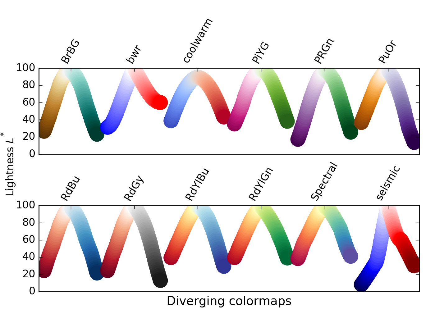
cmaps = ('bwr', 'coolwarm', 'spectral')
compare_colormaps(data.variables['altitude'].data, cmaps)
# Use compare_colormaps() to visualise divergent colormaps in this cell
Qualitative colormaps show varying lightness across the range of values, with many peaks and troughs. They can be useful for exploring data, but do not give a good relationship between lightness and data value, as perceptual colormaps.
These colormaps may reveal features in the dataset, or may be misleading
We can again visualise our data using a range of qualitative colormaps using the helper function compare_colormaps():
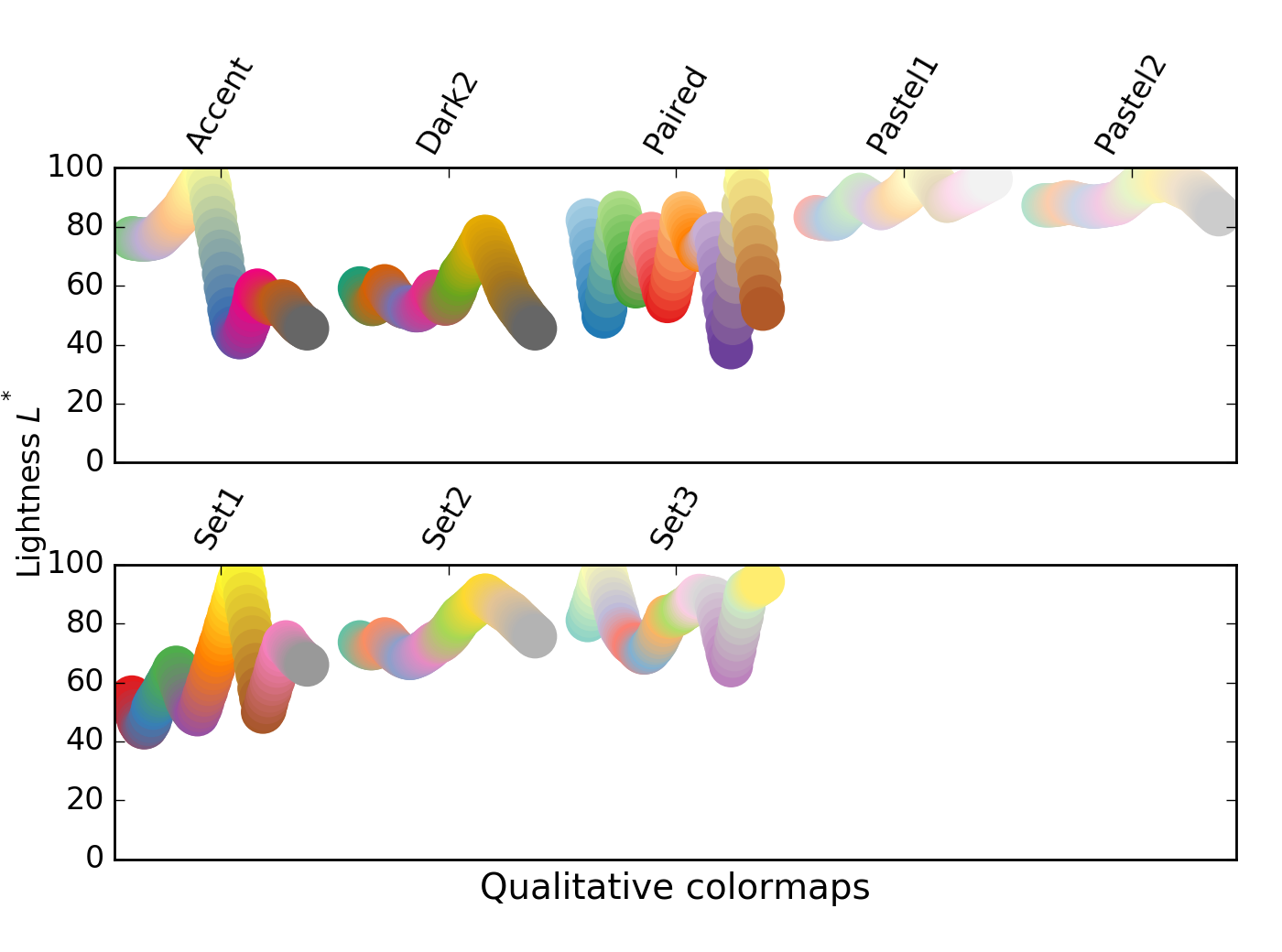
cmaps = ('accent', 'paired', 'Set1')
compare_colormaps(data.variables['altitude'].data, cmaps)
# Use compare_colormaps() to visualise qualitative colormaps in this cell
Miscellaneous colormaps span a range of applications. Some, such as ocean, terrain, and gist_earth have been created to aid in plotting topography, with meaningful colours that are interpretable as physical features. Other miscellaneous colormaps track geometrical paths through 3D colour space, and may not be useful as perceptual maps.
Some of these colormaps have been long-term default options in some packages (e.g. jet in MatLab).
These colormaps may be appropriate standards, or intuitive for a particular dataset, or they may be distractingly inappropriate.
We can again visualise our data using a range of miscellaneous colormaps using the helper function compare_colormaps():
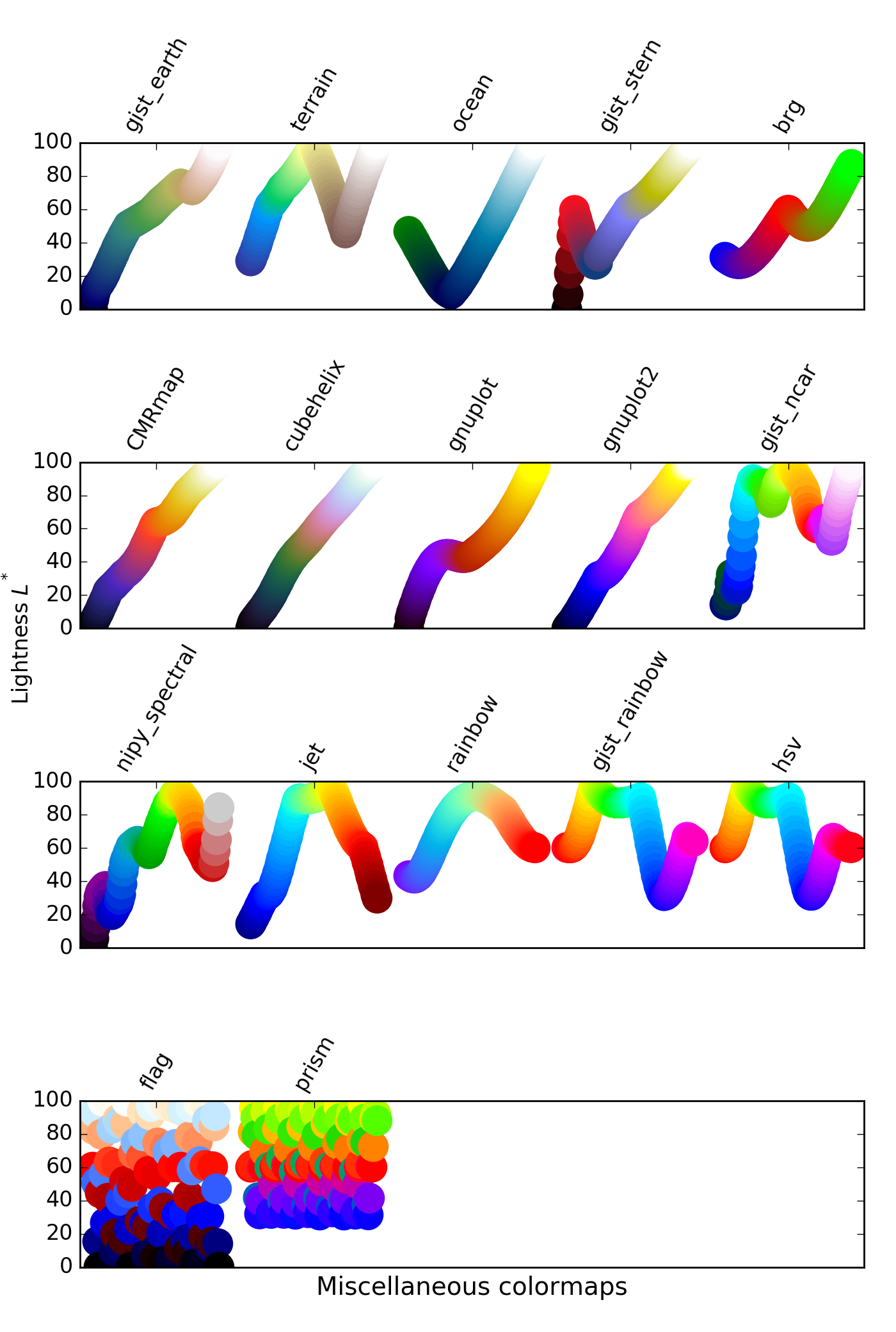
cmaps = ('gist_earth', 'terrain', 'ocean',
         'gnuplot', 'nipy_spectral', 'jet',
         'hsv', 'flag', 'prism')
compare_colormaps(data.variables['altitude'].data, cmaps)
# Use compare_colormaps() to visualise miscellaneous colormaps in this cell
QUESTION: How does each of these palettes influence your interpretation of the array data?
QUESTION: Which of these palettes (if any) do you think gives the most appropriate representation of your data?
QUESTION: What do you think would be the properties of a colormap that best represents the data, and why?
It will be fairly obvious to you that the dataset you are working with is some kind of geographical, topological data. This brings with it some kinds of expectations when visualising the data:
- That sea and land will be coloured differently
- That altitudes below sea level are probably covered by sea (though not always...), and that sea level has an 'altitude' of zero
The colourmaps gist_earth and terrain look like they should give us sensible colours for geographical data, but as we can see by plotting our data with those colormaps, the shore boundaries do not look to be correct, in that they do not separate land from sea very well.
cmaps = ('gist_earth', 'terrain', 'ocean')
compare_colormaps(data.variables['altitude'].data, cmaps)
# Plot the data with topological colormaps, here
For all of these colormaps, we can see from the colorbar scales that there does appear to be a transition from blue (sea) to earthy colours or white (land), though these transitions do not coincide with sea level (zero).
To modify these colourmaps to have a more sensible scale, we use matplotlib's colormap normalisation.
matplotlibcolormap normalisation: http://matplotlib.org/users/colormapnorms.html
The principle behind the normalisation we want to use is that our data (data[altitude']) spans a range of values from some minimum to some maximum: vmin to vmax. Values of zero in our dataset refer to measurements of terrain at sea level, and should correspond to the transition from sea colours to earth colours in our colormaps.
If we consider each colormap to span a range of values from 0..1, the sealevel transition occurs at a different point for each colormap:
gist_earth: sealevel ≈0.33terrain: sealevel ≈0.2ocean: sealevel ≈0.95
So we would like to define two linear scales for each colormap: one mapping those datapoints in the range [vmin..0] to [0..sealevel] on the colormap; and one mapping data in the range (0..vmax] to (sealevel..1] on the colormap.
This is a two-step process. First we define a normalisation that maps our data to these two scales, and then use this when rendering our data with imshow(). To define the normalisation, we need to create a subclass of matplotlib's colors.Normalize class. This is relatively technical Python compared to the rest of the workshop, so you can skip over the code in the next cell that implements this, if you find it too difficult.
# Code defining three classes for normalising our data to
# topographically-relevant colormaps
class GIST_EarthNormalize(mpl.colors.Normalize):
    def __init__(self, vmin=None, vmax=None, sealevel=None, clip=False):
        self.sealevel = sealevel
        mpl.colors.Normalize.__init__(self, vmin, vmax, clip)

    def __call__(self, value, clip=None):
        # I'm ignoring masked values and all kinds of edge cases to make a
        # simple example...
        x, y = [self.vmin, self.sealevel, self.vmax], [0, 0.2, 1]
        return np.ma.masked_array(np.interp(value, x, y))

class TerrainNormalize(mpl.colors.Normalize):
    def __init__(self, vmin=None, vmax=None, sealevel=None, clip=False):
        self.sealevel = sealevel
        mpl.colors.Normalize.__init__(self, vmin, vmax, clip)

    def __call__(self, value, clip=None):
        # I'm ignoring masked values and all kinds of edge cases to make a
        # simple example...
        x, y = [self.vmin, self.sealevel, self.vmax], [0, 0.2, 1]
        return np.ma.masked_array(np.interp(value, x, y))

# OceanNormalize doesn't have a straightforward pair of linear scales
# The altitude between sealevel and sealevel-10 is expanded between
# 0.875 and 0.95, which gives a crisper shoreline
class OceanNormalize(mpl.colors.Normalize):
    def __init__(self, vmin=None, vmax=None, sealevel=None, clip=False):
        self.sealevel = sealevel
        mpl.colors.Normalize.__init__(self, vmin, vmax, clip)

    def __call__(self, value, clip=None):
        # I'm ignoring masked values and all kinds of edge cases to make a
        # simple example...
        x, y = [self.vmin, self.sealevel-10, self.sealevel, self.vmax], [0, 0.875, 0.95, 1]
        return np.ma.masked_array(np.interp(value, x, y))
Now, when we use imshow() to visualise our data, we can employ one of these classes to normalise our data so that values above zero are (approximately) coloured as if they were above sea level, and values below zero are (approximately) covered as if they are covered by water.
The first step is to instantiate our normalisation object with the minimum and maximum values of data we wish to map, along with a data value that represents sea level (here, zero). We have to use data['altitude'][:] to copy the NetCDF data to an array, in order to use the .min() and .max() methods.
Next, we pass the argument norm to the imshow() function when we call it, in order to have the function normalise our data automatically.
norm = OceanNormalize(vmin=data.variables['altitude'].actual_range[0],
                      vmax=data.variables['altitude'].actual_range[1],
                      sealevel=0)
plt.imshow(data.variables['altitude'].data, origin='lower', cmap='ocean', norm=norm)
plt.colorbar()
This should render the image with a more familiar colour scheme.
# Display data with normalised values for each colormap
4. 3D representation of 2D array data
Python imports
The matplotlib libraries also provides tools for rendering 3D images of data. These are contained in the Axes3D module, which can be imported with:
from mpl_toolkits.mplot3d import Axes3D
This makes available several functions for plotting of 3D data, including plot3D(), plot_wireframe(), quiver3D() (3D field plots with arrows), and scatter3D().
# Import Axes3D
from mpl_toolkits.mplot3d import Axes3D
Preparing data
For our data, which by now we may realise describes points of altitude covering a portion of a planet's surface, the function we will use is plot_surface(). Our goal is to make the x and y co-ordinates of the 3D plot be the longitude (lon) and latitude (lat), respectively, and for the altitude variable to control the 'height' of the surface on the z axis. This is, usefully, the natural shape of the data in our NetCDF file.
Our first action is to describe the x and y co-ordinates as a meshgrid: two arrays of x and y values that, when combined, are tuples that define points on the lower face of the
3D graphing space. To do this, we define two linear spaces: evenly-spaced points beteween the maximum and minimum values of latitude and longitude in our data. The numpy function linspace() can be used to do this.
linspace: documentation
x = np.linspace(data.variables['lon'].actual_range[0],
                data.variables['lon'].actual_range[1],
                data.variables['lon'].shape[0])
y = np.linspace(data.variables['lat'].actual_range[0],
                data.variables['lat'].actual_range[1],
                data.variables['lat'].shape[0])
To get minimum and maximum values for each variable we have used the .actual_range attribute, which returns a (min, max) tuple for a netcdf_variable object. We have also used the .shape attribute (which returns a tuple of dimensions of the data) to determine the number of steps we need to define in linear space.
The output can be visualised with
print(x)
and seen to be a vector of evenly-spaced values from the minimum to the maximum value of the appropriate variable.
# Create linear spaces x and y for longitude and latitude data, and inspect the values
The next step is to create a 2D grid or mesh combining these values, so that each (lon, lat) tuple corresponds to a single point in the altitude dataset. We use NumPy's meshgrid command to do this, placing the output into xgrid and ygrid - x and y co-ordinates for each point in data.variables['altitude']:
xgrid, ygrid = np.meshgrid(x, y)
The properties of these arrays can be inspected:
xgrid.shape, ygrid.shape, data.variables['altitude'].shape
and confirmed to be the same dimensions as the altitude data.
# Create the meshgrid in xgrid and ygrid, and confirm their dimensions
# are the same as those of the altitude data
For convenience, we will assign the 'altitude' data to the variable z for plotting:
z = data.variables['altitude'].data
# Create the convenience variable z that holds the altitude data
Constructing the plot
To render a basic 3D plot, we will create a matplotlib Figure, to which we will add a subplot (referred to as our axes, and assigned to ax). We need to tell the subplot that we want a 3D projection of the data, and then call the ax.plot_surface() function to draw the surface, as the object surf (this allows us to refer to elements of the surface):
fig = plt.figure()  # The figure() holds the axes
ax = fig.add_subplot(111, projection='3d')  # The subplot is the axes
surf = ax.plot_surface(xgrid, ygrid, z) # We provide x,y meshgrid locations and z co-ords
# Create the figure, axes (with 3D projection, and surface plot)
This is a pretty uninspiring plot. It's just a small, dark surface, and we can't see any detail. We can try increasing the size of the figure, by passing figsize=(20, 15) as an argument to figure() when creating the plot:
fig = plt.figure(figsize=(20, 15))  # Set figure size
ax = fig.add_subplot(111, projection='3d')
surf = ax.plot_surface(xgrid, ygrid, z)
# Create a larger figure
Now the plot is bigger, but we have not solved our visualisation problem.
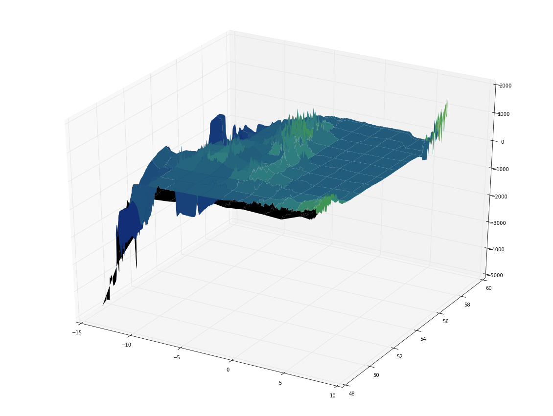
One of the factors preventing us from seeing detail here is how the 3D surface is represented. It is composed of lines that connect the datapoints on the surface, and faces that lie between the datapoints. Currently, the lines are so close together that we cannot see the colours of the faces.
We can try removing the lines to see what effect this have. We can also subsample the surface less finely, in order to see clearly what's going on with the faces. To do this, we set linewidth=0, and cstride and rstride to skip 100 values in each direction, in our call to plot_surface():
fig = plt.figure(figsize=(20, 15))
ax = fig.add_subplot(111, projection='3d')
surf = ax.plot_surface(xgrid, ygrid, z,
                       cstride=100, rstride=100,  # Skip by 100 datapoints on each axis
                       linewidth=0)  # Remove data lines
# Plot less data, using cstride, rstride and linewidth
Now we can see only the faces of the surface plot, but it's not very clear, still. It's possible to add a colormap with the cmap and norm arguments to plot_surface(), just as for 2D plots. But, when we try this with the cm.gist_earth colormap, the results are disappointing:
fig = plt.figure(figsize=(20, 15))
ax = fig.add_subplot(111, projection='3d')

norm_ge = TerrainNormalize(vmin=z.min(), vmax=z.max(), sealevel=0)  # Normalisation for colormap

surf = ax.plot_surface(xgrid, ygrid, z,
                       linewidth=0,
                       cstride=100, rstride=100,
                       cmap=plt.cm.gist_earth, norm=norm_ge)  # Use colormap and normalise
# Add a (normalised) colormap
The problem we have here is that our data array, z, contains non-numeric values: nans, as can be seen by inspection with print(z). Rather than using z.max() and z.min(), which return nan as both the minimum and maximum data values for scaling, we need to use the NumPy functions nanmin() and nanmax() to ignore those values.
fig = plt.figure(figsize=(20, 15))
ax = fig.add_subplot(111, projection='3d')

# Normalisation for colormap: ignore NaNs in data!
norm_ge = GIST_EarthNormalize(vmin=np.nanmin(z), vmax=np.nanmax(z), sealevel=0)

surf = ax.plot_surface(xgrid, ygrid, z,
                       linewidth=0,
                       cstride=100, rstride=100,
                       cmap=plt.cm.gist_earth, norm=norm_ge)
# Normalise ignoring NaNs
Reducing the number of values in the dataset we skip by reducing the values for cstride and rstride from 100 to 5, more detail can be shown.
fig = plt.figure(figsize=(20, 15))
ax = fig.add_subplot(111, projection='3d')

norm_ge = GIST_EarthNormalize(vmin=np.nanmin(z), vmax=np.nanmax(z), sealevel=0)

surf = ax.plot_surface(xgrid, ygrid, z,
                       linewidth=0,
                       cstride=5, rstride=5,  # Show more detail
                       cmap=plt.cm.gist_earth, norm=norm_ge)
# Show more detail by reducing cstride and rstride
The figure is still a little hard to interpret. The surface is semitransparent, so there is visual confusion towards the left hand side where the surface appears to fold on itself. We'd like to see this surface from another angle, to make the view clearer.
The axes can be rotated with ax.view_init(), passing the angle above the horizon, and the bearing from which we view the axes, to give a clearer view of the map:
fig = plt.figure(figsize=(20, 15))
ax = fig.add_subplot(111, projection='3d')
ax.view_init(60, 245)  # Rotate axes (245deg) and change elevation (60deg)

norm_ge = GIST_EarthNormalize(vmin=np.nanmin(z), vmax=np.nanmax(z), sealevel=0)

surf = ax.plot_surface(xgrid, ygrid, z,
                       linewidth=0,
                       cstride=5, rstride=5,
                       cmap=plt.cm.gist_earth, norm=norm_ge)
# Rotate the figure to get a better view
Now we can see coloured faces of the surface plot, and it's a pretty clear 3D map of elevation and depth for a view on the UK and Ireland.
We can add a colorbar scale with the colorbar() function, just as for 2D plots. We need to tell it what the graph surface is so that it can relate datapoint values to colours, and it can help to shrink the scale so it does not dominate the plot.
fig = plt.figure(figsize=(20, 15))
ax = fig.add_subplot(111, projection='3d')
ax.view_init(60, 245)

norm_ge = GIST_EarthNormalize(vmin=np.nanmin(z), vmax=np.nanmax(z), sealevel=0)

surf = ax.plot_surface(xgrid, ygrid, z,
                       linewidth=0,
                       cstride=5, rstride=5,
                       cmap=plt.cm.gist_earth, norm=norm_ge)

plt.colorbar(surf, shrink=0.5);  # Add a colorbar scale
# Add a colorbar scale
To be a little more fancy, we could add coloured lighting effects using shaders, rather than colouring the surface directly.
To do this, we need to add a lightsource: the mpl.colors.LightSource() object, setting its location (azimuth and altitude) to cast some light - and shadows.
We are in full control of the lightsource, and can use it to shade each face of the surface individually by calling its shade() method, for which we can provide a colormap, and a normalisation function, as for 2D plots. This determines the colour quality of the light that is 'reflected' from each datapoint.
We could set also set shade=True and antialiased=True for a smoother rendering, if we liked.
fig = plt.figure(figsize=(20, 15))
ax = fig.add_subplot(111, projection='3d')
ax.view_init(60, 245)

norm_ge = GIST_EarthNormalize(vmin=np.nanmin(z), vmax=np.nanmax(z), sealevel=0)

ls = mpl.colors.LightSource(azdeg=315, altdeg=45)  # Create light source
rgb = ls.shade(z, cmap=plt.cm.gist_earth, norm=norm_ge)  # Add shader to colour datapoints

surf = ax.plot_surface(xgrid, ygrid, z,
                       linewidth=0,
                       cstride=5, rstride=5,
                       facecolors=rgb)  # Use shader rather than colourmap to colour surface
# Add a shader
And we're done - we have created a 3D surface plot of our data, with an appropriate colour scheme, normalised to a meaningful boundary condition, and shaded with complex lighting effects.