Grammar of Graphics 
Introduction
The Grammar of Graphics is a way of understanding the representation of data that differs from the 'traditional' way of thinking in terms of specific kinds of plot. It was pioneered by Leland Wilkinson in the early 2000s, but massively popularised, and very well explained, by Hadley Wickham and applied in the incredibly popular ggplot libraries in R.
- Hadley Wickham's "A Layered Grammar of Graphics"
- Review of "The Grammar of Graphics" (Wilkinson)
ggplot2: home page
The central premise of the grammar of graphics is data and its representation are handled separately. This allows for components of a plot to be customised easily to achieve a specific representation that allows you to explore and understand your data, or explains it to others, effectively.
If you are coming to the grammar of graphics for the first time, it can appear quite non-intuitive, but I hope you will see that it has many advantages over considering graphical representation in terms of archetypal 'types' of plot.
In this notebook you will learn how the grammar of graphics is applied in the Python module ggplot, and how to apply its principles to your own datasets.
Python imports
The code in the cell below suppresses noisy warnings from matplotlib and pandas
import warnings
warnings.filterwarnings('ignore')
Learning Outcomes
- Understand the Grammar of Graphics
- Use the Grammar of Graphics with the
ggplotmodule to produce a scatterplot from aesthetics and geometric representations. - Use layers to produce new visualisations specifically to suit your data, showing data and statistical summaries
- Use multi-panel figures to display complex datasets
Exercise
1. Producing a Basic Scatterplot
In this part of the exercise, you will produce a basic scatterplot of socioeconomic data, and work through understanding the elements of the plot and how they relate to the grammar of graphics.
Python imports
The ggplot Python module implements the grammar of graphics in a style similar to that used for R's ggplot2 library
ggplotmodule: project page
and we will use it for this exercise.
ggplot is intended to work well with the DataFrame representations of the Pandas module - a little like a reimplementation of R's data philosophy in Python, so we also import this module.
%matplotlib inline

from ggplot import *

import pandas as pd
# Import ggplot and pandas modules
%matplotlib inline

from ggplot import *

import pandas as pd
Importing data
We will need some data to work with, and for this we will use data from the R package gapminder, which describes an excerpt of the Gapminder data on life expectancy, GDP per capita, and population by country.
gapminderdata: R documentationpandas: documentation
This is located under this repository's root directory in the data subdirectory in tab-separated tabular format, as gapminder.tab. We can import this to a DataFrame in the variable gapminder using pandas:
gapminder = pd.read_csv("../../data/gapminder.tab", sep="\t")
# Import gapminder data into the variable gapminder
gapminder = pd.read_csv("../../data/gapminder.tab", sep="\t")
We can peek at the data in a pandas dataframe with the .head() method, which shows is the first few lines, along with header and row index information. The .describe() method will show summary information on the data in each column.
To see what data type each column holds, we can look at the .dtypes attribute of the dataframe
gapminder.head()
gapminder.describe()
gapminder.dtypes
- QUESTION: What data is contained in the
gapminderdataframe? How is it organised? - QUESTION: What are the minimum and maximum values in each column?
- QUESTION: What data types are
country,popandlifeExp? Why do you think these columns have these data types?
# Peek at the gapminder data
The elements of a scatterplot
We can plot the data in gapminder using ggplot as though it were any other plotting library, just to render a basic scatterplot. We will do this by plotting life expectancy against GDP per capita with ggplot's qplot() function. This emulates the qplot() function in R's ggplot2 library, but has this Python-specific difference:
- dataframe variables must be provided as strings
qplot('lifeExp', 'gdpPercap', data=gapminder, color='continent')
# Use qplot to produce a basic scatterplot of gapminder data
qplot('lifeExp', 'gdpPercap', data=gapminder, color='continent')
2. Understanding a Scatterplot
It is likely that you can treat the scatterplot you have just produced quite intuitively. After all, you've probably seen a few scatterplots in your time.
The plot has x- and y- axes, and a large number of points plotted against those axes, indicating associations between life expectancy and GDP per capita for each point. The points are coloured according to the continent on which the datapoint was measured, and these colours are indicated in a legend.
By quick visual inspection, we can see that the blue points (Europe) are associated with high life expectanct, and red points (Africa) a low life expectancy. So, this representation has value in summarising our large gapminder table, and allowing us to infer patterns in the data.
This convenience function (the default scatterplot) was quick and easy to draw, and informatics, but it's not very easy to modify or customise the representation. What if we'd like to build a plot like this, but different?
We're going to consider the plot elements (in bold above) in a little more detail, to break them down a bit in terms of the grammar of graphics, so we can build highly customisable plots to represent your data.
Firstly, we note that every observation in the data is a single point. Each point has an aesthetic that determines how it is rendered in the plot. The aesthetics we can control are:
- x- and y- co-ordinate
- shape
- size
- colour
Most obviously, the x- and y- co-ordinates are mapped to the variables lifeExp and gdpPercap, respectively. The colour aesthetic is mapped to the continent variable.
These two mappings differ, because of the kind of variable being mapped:
lifeExpandgdpPercapare continuous variablescontinentis a discrete variable
For an arbitrary set of points, we could describe x-, y- and colour aesthetics as in the table below:
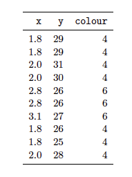
This should remind you of a DataFrame, and with good reason:
Aesthetics essentially create a new dataset that corresponds to your original data, but that contains aesthetic information. Building a plot involves creating mappings from your data to produce values in this aesthetic dataset.
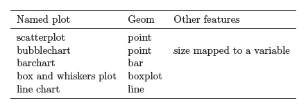
Independently of the aesthetics described above, we can consider different ways of drawing a dataset:
- If we draw data with points, we have a scatterplot
- If we draw data with lines, we have a line plot
- If we draw data with bars, we have a bar chart
and so on.
These types of representation are referred to as geometric representations, or geoms, for short.
- Not all
geoms make sense for a given dataset, even though they may be "grammatical". - It is possible to combine multiple
geoms to produce new graphs
In the grammar of graphics, visualisations are built up as layers. Each layer has at least two parts:
- data and its aesthetic mapping
- a geometric representation (
geom)
Additionally, each layer may also have optional statistical transformations or adjustments (e.g. scalings, or fitted curves).
One approach to creating a plot with layers is first to create a base layer that contains the default dataset and defines aesthetics for it, and then to add additional layers that provide geometric representations. We will do this now to reproduce the scatterplot you drew above.
Base layer
We create a base layer as an instance of the ggplot() Class, and assign it to a variable p. The ggplot() is created with gapminder as the dataset, and with aesthetics that map the lifeExp and gdpPercap continuous variables to the x- and y- co-ordinates, respectively.
p = ggplot(gapminder, aes(x='lifeExp', y='gdpPercap', color='continent'))
# Create the plot base layer
First geom layer
You will notice that, although you have created a base layer, there is no plot visible. This is in part because no geometric representation has been defined and, without this representation of the data, there is nothing to be drawn.
To produce a figure, we add a geom to the base layer in p:
p + geom_point()
# Use a geom_point() to produce a scatterplot
This only temporarily changes the plot, as the base plot in p remains unchanged. To make a 'permanent' change to a base plot, and to show it in the notebook, we can use the code:
p = ggplot(gapminder, aes(x='lifeExp', y='gdpPercap', color='continent'))
p += geom_point()
p
# Add the geom_point() to the base plot in p, and render the whole scatterplot
This now matches our earlier effort, and we can continue to add new geoms to the plot to build up more information:
p = ggplot(gapminder, aes(x='lifeExp', y='gdpPercap', color='continent'))
p += geom_point()
p += xlab("life expectancy")
p += ylab("GDP per capita")
p += title("gapminder example data")
p
# Add axis labels and a title to the plot
CHALLENGE: Can you modify the example above so that the figure visualises how life expectancy has changed over time, as a scatterplot?
# Answer challenge in this cell
3. More Layers
An advantage to using the grammar of graphics approach to producing visualisations is that it is possible to stack layers of geoms to better visualise data. In this subsection we will see how to stack different types of geometric representation to obtain bespoke visualisations.
The challenge answer above doesn't look very good as a data representation. While we can get a sense of the variation between continents, it is difficult to follow data points to track a single country over the data period. To see this information more clearly, we can use a geom_line() object to render a line plot:
p = ggplot(gapminder, aes(x='year', y='lifeExp', color='continent'))
p + geom_line()
# Render a line plot with geom_line()
This hasn't worked very well. The data have not been grouped by country but instead by continent. The lines go vertically between all points for a single continent in each year, before skipping to the next year.
To connect datapoints by country, we need to specify country as the grouping variable when we define the base aesthetic:
p = ggplot(gapminder, aes(x='year', y='lifeExp', color='continent', by='country'))
p + geom_line()
# Group datapoints by country, and render a line plot
This looks much better, and now we can overlay or stack another geom - this time to place individual data points, with geom_point():
p = ggplot(gapminder, aes(x='year', y='lifeExp', color='continent', by='country'))
p + geom_line() + geom_point()
# Stack a geom_point() on a geom_line() for the gapminder data
To an extent (though less so than for the equivalent objects in R), we can modify aesthetics independently in separate layers. For example, we can set the colours of all plotted datapoints in the geom_point() layer to be black:
p = ggplot(gapminder, aes(x='year', y='lifeExp', color='continent', by='country'))
p + geom_line() + geom_point(color='black')
# Redraw the stacked plot, with black datapoints
Transformations, scalings and statistical summaries of data are another kind of layer, and can be stacked just like geoms.
In our earlier plot of 'GDP per capita' against 'life expectancy', it could be difficult to distinguish GDP on the y-axis:
p = ggplot(gapminder, aes(x='lifeExp', y='gdpPercap', color='continent'))
p + geom_point()
# Plot GDP against life expectancy
We might consider using a log transformation of the GDP data. We could do this by creating a new column in our data table, filling it with transformed data, and then plotting this new column in place of gdpPercap. However, we can apply a scaling directly to our plot with the scale_y_log() transformation.
p = ggplot(gapminder, aes(x='lifeExp', y='gdpPercap', color='continent'))
p + geom_point() + scale_y_log()
(there is a counterpart scale_x_log() transformation). This essentially applies a transformation/mapping 'on-the-fly' to the data, as it is plotted.
# Replot the data with a log y-axis
Although it may seem abstract, the action of recolouring data is also a transformation (but onto a domain of colours, rather than numerical values). Colour transformations/scalings are applied in the same way. The code below will redraw the plot with one of the colorbrewer palettes.
colorbrewer: interactive examples
p = ggplot(gapminder, aes(x='lifeExp', y='gdpPercap', color='continent'))
p + geom_point() + scale_y_log() + scale_color_brewer()
Many options are available for colorbrewer palettes, and some experimentation may be useful when exploring your own data:
scale_color_brewer(type='qual')
scale_color_brewer(palette=3)
scale_color_brewer(palette=2, type='div')
# Replot the log-transformed data with a Brewer colour scale
Statistical analyses also transform data, usually by performing a data summary such as smoothing or binning. In the Python ggplot module, two layers are available. The first of these, stat_smooth, attempts to fit a smooth curve to your data (according to how it is grouped), and provides a visual estimate of confidence interval on the smoothing:
p = ggplot(gapminder, aes(x='year', y='lifeExp', color='continent'))
p + geom_point() + stat_smooth()
QUESTION: How has life expectancy changed for each continent?
# Plot smoothed curves by continent for life expectancy over time
The second statistical summary layer, stat_density() plots a kernel density estimate (KDE) of frequency for a given x-variable. The code below plots the frequency of a given life expectancy grouped by continent, for all countries and all years measured:
p = ggplot(gapminder, aes(x='lifeExp', color='continent'))
p + stat_density()
QUESTION: How does life expectancy vary by continent?
# Plot smoothed curves by continent for life expectancy over time
4. Multi-panel figures
So far we have shown all our data in a single plot. We have used different colours and geometric representations to make our figures clearer, but sometimes multi-panel figures can give much clearer overviews of data, generally as small multiple plots.
Small multiple plots (aka trellis, lattice, grid or facet plots) are similar graphs using the same scales and axes, but representing different subsets of a complete dataset, allowing them to be easily compared visually. These plots are fairly easy to represent using ggplot, as in this module the facet_wrap() or facet_grid() object is just another layer of the plot.
A single plot that groups our gapminder data by country, colouring them by continent, is messy and hard to read:
p = ggplot(gapminder, aes(x='year', y='lifeExp', color='continent', by='country'))
p + geom_line()
QUESTION: Can you tell how life expectancy has changed on each continent?
# Group datapoints by country, and render a line plot
Using a small multiple plot with the facet_wrap() layer, we can split plots out on the basis of a named variable. Here we will split by continent:
p = ggplot(gapminder, aes(x='year', y='lifeExp', color='continent', by='country'))
p + geom_line() + facet_wrap('continent')
QUESTION: How has life expectancy changed on each continent?
# Group datapoints by country, and render a line plot
This breaks up the plot into five plots, each with the same x- and y-axes and scales. This allows for a direct visual comparison, where we can readily see the trends and variation on a continent-wise basis.
Similarly, we can split our larger scatterplot into twelve subplots by year, and see at a glance how the GDP per capita and life expectancy has varied over time, with a common log scale on the y- axis for each plot.
p = ggplot(gapminder, aes(x='lifeExp', y='gdpPercap', color='continent'))
p + geom_point() + scale_y_log() + facet_wrap('year')
QUESTION: Can you tell how the relationship between GDP per capita and life expectancy changed in each continent, since 1980?
# Create a facet plot by year of gdpPercap vs lifeExp, coloured by continent
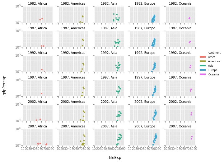
It is possible to create facets that are split on the basis of more than one variable. For example, we can plot data separately for each continent and year since 1980, with the code below:
gapminder_recent = gapminder.loc[gapminder['year'] > 1980,]
p = ggplot(gapminder_recent, aes(x='lifeExp', y='gdpPercap', color='continent'))
p + geom_point() + scale_y_log() + facet_wrap('year', 'continent', ncol=5)
QUESTION: How has the relationship between GDP per capita and life expectancy changed in each continent, since 1980?
# Create a facet plot by year and continent, of gdpPercap vs lifeExp since 1980, coloured by continent