Making Movies with matplotlib 
Introduction
matplotlib provides tools for producing animations from its plots. Animations can provide compelling visuals to get ones point across, and represent information in ways that are not possible with static views. But these tools are not exempt from the usual principles of good graphical representation, and they also bring new considerations, such as presenting only single frame 'snapshots' of data at any one time, rather than a complete account of the dataset.
FFmpeg: https://ffmpeg.org/MPlayer/MEncoder: http://www.mplayerhq.hu
matplotlib's central animation functionality is built around the animation module, and in this exercise we will use the FuncAnimation() class to generate an animated view onto the gapminder data that is also used in the Grammar of Graphics exercise.
Python imports
The code in the cell below suppresses noisy warnings from matplotlib and pandas
import warnings
warnings.filterwarnings('ignore')
We will use the pylab magic to make matplotlib available, and import seaborn as the sns namespace. To import the Gapminder data we'll use Pandas, imported as the pd namespace.
We also need to import the animation module explicitly, as this is not provided by pylab, and to visualise the animation in the notebook we need to enable generation of HTML5 movies with the HTML module from IPython.display.
# Import ggplot and pandas modules
%matplotlib inline

from matplotlib import animation
import seaborn as sns
import pandas as pd

from IPython.display import HTML
# Imports
%matplotlib inline

import matplotlib.pyplot as plt
import numpy as np

from matplotlib import animation
import seaborn as sns
import pandas as pd

from IPython.display import HTML
Learning Outcomes
- Understand
matplotlib'sanimationfunctionality - Generate animations using
FuncAnimation - Generate line graph and bubble plot animations
Exercise
1. Producing a Basic Animation
In this part of the exercise, you will produce an animation of a sine wave function, to explore the principles of the FuncAnimation() class.
The generation of individual images is handled by the FuncAnimation() class. This needs to know how many frames to draw, and the time interval between frames, so they can all be compiled together in a movie.
To draw each frame, FuncAnimation() calls a function (which you will name below), which renders each frame in sequence, passing
Firstly, you need to set up a figure() in which the plot will be rendered.
Here, we will create the figure() object fig, and add subplot axes ax to describe the plot itself, setting x- and y-axis limits appropriate for a sin wave plot. So far, this is just like creating a static figure
fig = plt.figure()
ax = fig.add_subplot(1, 1, 1,
                     xlim=(0, 2), ylim=(-2, 2))
We want to draw a single line plot of f(x) = sin(x) where x is in the range [0, 2). To do this we would use a line plot, so we add an ax.plot() object, which holds the graphical object that will be drawn, and assign this to the variable line. Initially, we provide empty data in the form of two empty lists as x and y data, so that no line is drawn. We set a slightly thicker line than usual with lw=2 as an option.
line, = ax.plot([], [], lw=2)
We will also, for illustration, write some text to indicate which frame number is being rendered, using an ax.text() object. Again, initially this is set to an empty string to give a 'clean' plot:
text = ax.text(0, 1.75, '')
# Use this cell to create the clean base plot with the code above
The animation.FuncAnimation() function will allow us to specify an init_func which draws a clear frame; if we don't do this, then the first item in the sequence will be retained throughout the animation. We need, therefore, to provide a function that clears the data from the aniated graph.
We will call this function init_sine() and use it to clear the line data and text string from the plot:
def init_sine():
    line.set_data([], [])
    text.set_text('')
    return(line, text)
# Create the function for init_func in this cell
Now we create the function that will be called by animation.FuncAnimation(). We will call it animate_sine(), and it will receive the number of the frame being rendered, when it is called from FuncAnimation() - we catch this as the function parameter i.
Within the body of the function we write the code to render the sin curve:
def animate_sine(i):
    x = np.linspace(0, 2, 1000)
    y = np.sin(2 * np.pi * x)
    line.set_data(x, y)
    text.set_text('frame: {0}'.format(i))
    return(line, text)
First we generate a linear space of 1000 x values in the range [0, 2), and then apply the function $y = \sin(2\pi x)$. This gives us two arrays of variables in x and y. These are then passed to the line object as the data to plot, with line.set_data(x, y), and the frame number caught in the parameter i is written with text.set_text().
# Create the animate_sine() function in this cell
Now we can create the FuncAnimation() object, passing it the figure to render, and the initialisation (init_sine()) and animation (animate_sine()) functions, specifying the number of frames and the time interval between frames in ms.
anim = animation.FuncAnimation(fig, animate_sine, init_func=init_sine,
                               frames=100, interval=20, blit=True)
# Create the FuncAnimation object in this cell
To render the animation in the notebook, we use the FuncAnimation() class' to_html5_video() method, and the IPython HTML class.
HTML(anim.to_html5_video())
# Render the animation in this cell
This may not be what you expect. There is clearly an animation, but while the frame number is being reported with each change of frame, the sine wave is not moving.
The sine wave is being updated on each frame, but the same data is being plotted over and over again. We need to link the sine wave rendering with the frame number that's being passed, in order to cause the image to change.
We can do this by changing the was y is specified in the animate_sine() function from y = sin(2 * pi * x) to an expression involving i, such as:
y = sin(2 * pi * (x - 0.01 * i))
which steps the curve along the x-axis in increments of 0.01.
# Change the animate_sine() function in this cell, and rerender the animation.
2. Animating gapminder Data
Importing data
We will be importing data from the R package gapminder, which describes an excerpt of the Gapminder data on life expectancy, GDP per capita, and population by country. You will have used this data in the Grammar of Graphics exercise.
gapminderdata: R documentation
This is located under this repository's root directory in the data subdirectory in tab-separated tabular format, as gapminder.tab. We can import this to a DataFrame in the variable gapminder using pandas:
gapminder = pd.read_csv("../../data/gapminder.tab", sep="\t")
# Import gapminder data in this cell
Designing the plot
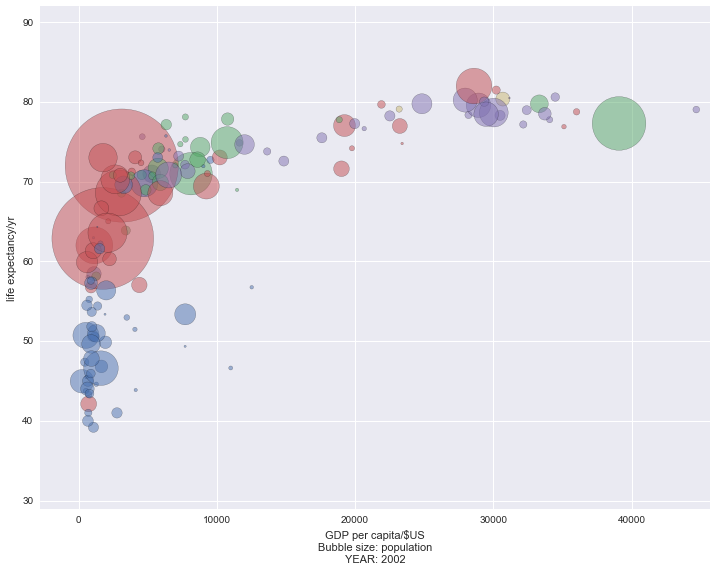
Your goal in this part of the exercise will be to render an animation of life expectancy against GDP, by country, over time. This will eventually be rendered as a bubble plot, where the size of each bubble represents population size for that country.
We will begin by designing a single static representation of the bubble plot, for a single year (2002). For this, we'll create a subset of our data in the variable gm2002:
gm2002 = gapminder.loc[gapminder['year']==2002,]
# Create gm2002 data subset here, and inspect it
We'll piece together creation of a bubble plot showing life expectancy against GDP. First we need to set up a figure() and subplot axes, which we do as fig2002 and ax2002:
fig2002 = plt.figure(figsize=(12, 9))
ax2002 = fig2002.add_subplot(1, 1, 1)
To set axes limits, we'll add a little buffer beyond the minimum and maximum values for both GDP and life expectancy, so that we can accommodate some of the larger bubbles. We use ax2002.set_xlim() and ax2002.set_ylim, passing values derived from our dataset directly to set the limits:
ax2002.set_xlim(np.floor(gm2002['gdpPercap'].min()) - 3000,
                np.floor(gm2002['gdpPercap'].max()) + 1000)
ax2002.set_ylim(np.floor(gm2002['lifeExp'].min()) - 10,
                np.floor(gm2002['lifeExp'].max()) + 10)
We set axis labels in the same way:
ax2002.set_xlabel('GDP per capita/$US\nBubble size: population\nYEAR: 2002')
ax2002.set_ylabel('life expectancy/yr')
We'd like to set the colour of each bubble to represent something meaningful, such as continent. We'll do this by pairing up each unique continent name with a value from seaborn qualitative colour palette. This is a fairly fancy construction that does the following:
- lists unique continent names in the data with
unique(gm2002['continent']) - pairs these names with individual colours from
sns.color_palette() zip()s these values intocontinent, colourpairs- uses
dict()to create a dictionary ofcontinent: colourkey: value pairs that can be used to shade bubbles in the plot
The resulting dictionary is placed in the variable cmap:
continents = np.unique(gm2002['continent'])
cmap = dict(zip(continents, sns.color_palette()))
Next, we create two lists of values for each datapoint - one of colors and one of sizes, to shade and shape the bubbles. The colors list is compiled from the cmap dictionary above, but the sizes list is a straightforward transformation of the population data in gm2002['pop'], dividing it by 1e5 so that the bubbles are a reasonable size on the plot.
colors = [cmap[con] for con in gm2002['continent']]
sizes = gm2002['pop'] * 1e-5
Finally, we render the scatterplot, with x- data from gm2002['gdpPercap'] and y-data from gm2002['lifeExp']. We pass size and colour information, and because there will be considerable overlap of points, we render everything with alpha transparency of 0.5:
for continent in continents:
    data = gm2002.loc[gm2002['continent'] == continent,]
    sizes = data['pop'] * 1e-5
    ax2002.scatter(data['gdpPercap'], data['lifeExp'],
                   s=sizes,
                   alpha=0.5,
                   c=cmap[continent])
# Render a static scatterplot in this cell
Animating the plot
Animating our data, the first thing to do is generate 'clean' base axes, setting axis limits on the basis of the complete gapminder dataset, and adding axes labels:
figgdp = plt.figure(figsize=(12, 9))
axgdp = figgdp.add_subplot(1, 1, 1)

axgdp.set_xlim(np.floor(gapminder['gdpPercap'].min()) - 10000,
               60000)
axgdp.set_ylim(np.floor(gapminder['lifeExp'].min()) - 10,
               np.floor(gapminder['lifeExp'].max()) + 10)

ax2002.set_xlabel('GDP per capita/$US\nBubble size: population')
ax2002.set_ylabel('life expectancy/yr')
# Create the clean base axes in this cell
Next we create initial scatterplot data, for the first year in the data (1952), so that the animation has some initial datapoints to work with. First we extract the data for 1952:
data = gapminder.loc[gapminder['year'] == 1952,]
Then we create lists of colour and size data for each country's datapoint, as before:
sizes = data['pop'] * 1e-5
colors = [cmap[con] for con in data['continent']]
We need to create a scatterplot that persists between frames, putting this in the variable scat. We will refer to the datapoints in this scatterplot in both the init_func and update functions of the FuncAnimation() object.
scat = axgdp.scatter(data['gdpPercap'], data['lifeExp'], s=sizes, c=colors, alpha=0.5)
# Initialise the scatterplot data in this cell
We need to create two functions, one to clear datapoints between frames (which will be passed as init_func to the FuncAnimation object), and another to update datapoints at each frame.
To clear datapoints, we use the set_offsets() method of the scatterplot scat. This takes an $n \times 2$ array (or an empty iterable) and updates the x,y coordinates of each datapoint in the scatterplot. Passing an empty iterable clears all the locations, rendering an empty scatterplot - so this is what we do in the function init_gdp(), which will be our 'reset' function between frames:
def init_gdp():
    scat.set_offsets([])
    return(scat,)
To update datapoints, we need to translate the frame number into a year for which data can be plotted. As there are 12 years covered by the data (use unique(gapminder['years']) to see this), we will render 12 frames only in the animation, and use each frame number as an index onto the list of years covered, storing this in the variable data:
year = unique(gapminder['year'])[frame_number]
data = gapminder.loc[gapminder['year'] == year,]
Next, we'll use the data extracted only for that year to update the x,y coordinates for the scatterplot. We have to do some data-wrangling here, as we move from a pandas DataFrame to a NumPy ndarray, and we also have to transpose the data to put it in the correct orientation for scat.set_offsets() ($n \times 2$):
plotdata = transpose(asarray((data['gdpPercap'], data['lifeExp'])))
scat.set_offsets(plotdata)
Now we will update the sizes of each scatterplot datapoint to reflect the population size:
scat.set_sizes(data['pop'] * 1e-5)
and the x-axis label to indicate which year we are looking at:
axgdp.set_xlabel('GDP per capita/$US\nBubble size: population\nYEAR: {0}'.format(year))
Putting this all together in the update function, catching the frame number in frame_number:
def update_gdp(frame_number):
    # Get year and data to be rendered
    year = np.unique(gapminder['year'])[frame_number]
    data = gapminder.loc[gapminder['year'] == year,]

    # Update scatterplot location data
    plotdata = np.transpose(np.asarray((data['gdpPercap'], data['lifeExp'])))
    scat.set_offsets(plotdata)

    # Update scatterplot sizes and axis label
    scat.set_sizes(data['pop'] * 1e-5)
    axgdp.set_xlabel('GDP per capita/$US\nBubble size: population\nYEAR: {0}'.format(year))

    return(scat,)
# Create the initialisation and update functions in this cell
Finally, we can create an instance of FuncAnimation(), updating over 12 frames (one for each year), one every 0.5s, and visualising in the current notebook.
anim_gdp=animation.FuncAnimation(figgdp, update_gdp, init_func=init_gdp, frames=12, interval=500)
HTML(anim_gdp.to_html5_video())
# Render the animation in this cell
3. Saving movies
To write a movie to a file, you will need either the FFmpeg or MEncoder packages to be installed, as they provide the movie conversion capability for matplotlib.
The most straightforward way to write the output from one of the FuncAnimation() instances you created above is with the FuncAnimation.save() method:
anim_gdp.save('bubble_chart.mp4')
The code above will write a default .mp4 video to file using an appropriate conversion tool, but several options to control image size and conversion backend are available, as can be seen with help(anim_gdp.save), e.g.
anim_gdp.save('bubble_chart.m4v', writer="ffmpeg", dpi=300, fps=2)
### Write the bubble chart animation to file