One variable continuous data in matplotlib and seaborn 
Introduction
This notebook exercise will describe visualisation of one-dimensional continuous data in Python, using the matplotlib and seaborn libraries.
For these examples, we will work with randomly-sampled data from statistical distributions that you will generate using this notebook.
Python imports
To view images in the notebook, we run a cell containing the line:
%matplotlib inline
This will make matplotlib and NumPy libraries available to us in the notebook.
Seaborn can be imported with the following code:
import seaborn as sns
# Run the pylab magic in this cell
%matplotlib inline

import matplotlib.pyplot as plt

# Import seaborn
import seaborn as sns

# Random number generation
import random
import warnings
warnings.filterwarnings('ignore')
# Turn off warning messages
import warnings
warnings.filterwarnings('ignore')
Learning Outcomes
- Generating randomly-distributed example data
- Representing one-dimensional continuous-valued data with histograms, KDE plots, and rug plots
- Using
matplotlibandseabornlibraries - Presenting arrays of images
- Use of
figure()andsubplots()
Exercise
1. Creating a randomly-distributed 1D dataset
Creating the dataset
The Numpy library contains a module called random which provides a number of utility functions for generating (pseudo-)random value data. This is imported when you use the %pylab inline magic, and you can find out more about this module with help(random).
We will use the random.random() function to generate 100 datapoints, which we will assign to the variable data. We will explore the distribution of this data graphically using matplotlib
data = [random.random() for _ in range(100)]
Other random samplings are available, such as:
random.randint(10, size=10): integers in a rangerandom.randn(10): standard normal distributionrandom.negative_binomial(1, 0.1, 10): negative binomial distribution
and so on. You should feel free to experiment with them using the code below
# Create the variable data, containing 100 random values, here
2. Histogram
Base histogram
Histograms show the distribution of data over a continuous interval. The total area of the histogram is considered to represent the number of datapoints, where the area of any bar is proportional to the frequency of datapoints in that interval, or bin.
You can draw a basic histogram of your dataset using the hist() function, as in the code below:
n, bins, patches = plt.hist(data)
# Draw basic histogram in this cell
You will probably find this basic histogram to be pretty uninspiring. The colour choice is flat, and the whole appearance is quite blocky and uninformative. It also lacks a title or any other detail.
The objects returned by the hist() function in the code above are:
n: an array of values for each bar in the histogram, reflecting its height on the y-axisbins: an array of the breakpoints for each bin (where the edges of each bin lie on the x-axis)patches: objects representing the graphical elements for each bar; these can be manipulated to modify the plot's appearance
You can explore the contents of these variables in the cell below
# Explore the contents of n, bins, and patches in this cell
Normalised histograms
The base histogram above reports absolute counts of the data in each bin. A normalised histogram reports frequencies, essentially modifying bin heights so that the integral of the histogram (summed area of all the bars) is equal to unity (1). This makes the histogram equivalent to a (stepped) probability density curve.
To generate a normalised histogram, you can set normed=1 in the call to hist():
n, bins, patches = plt.hist(data, normed=1)
# Create a normalised histogram in this cell
You will notice that the values on the y-axis have changed.
Modifying histogram appearance, and subplots
We can modify several aspects of the histogram's appearance (see, e.g. help(hist) for documentation) in the call to hist():
bins: the number of bins into which the data will be dividedfacecolor: the colour of each rectangle in the histogramalpha: the transparency value for the rectangles histogram (useful when layering plots)
We'll try this with the code below:
n, bins, patches = plt.hist(data, normed=1, bins=20, facecolor='green', alpha=0.6)
# Modify the histogram appearance in this cell
Stepfilling
So far, our histograms have filled each of the bars with a border line, which makes the plot look more like a density plot. Other representations are available, such as: histtype='step', that renders the bar chart as a boundary line:
n, bins, patches = plt.hist(data, normed=1, bins=20, facecolor='green',
                            alpha=0.6, histtype='step')
# Create a step style histogram
3. Subplots and labels
We often wish to place multiple sets of axes on the same overall figure, to enable several related visualisations to be placed alongside each other. To do this, we place histograms - or any other plot - into subplots.
The general approach for matplotlib is as follows:
- Create a
Figure()object - Add as many subplots (
Axes()) to theFigure()as you require, specifying their location in a grid structure. - Add your visualisations to the subplot (
Axes()) objects
In the example below, we will create a 1x3 grid, and revisualise the three histograms from the examples above, with the code below:
# Create figure
fig = plt.figure()

# Create subplot axes
ax1 = fig.add_subplot(1, 3, 1)  # 1x3 grid, position 1
ax2 = fig.add_subplot(1, 3, 2)  # 1x3 grid, position 1
ax3 = fig.add_subplot(1, 3, 3)  # 1x3 grid, position 1

# Add histograms
ax1.hist(data)
ax2.hist(data, normed=1)
ax3.hist(data, normed=1, bins=20, facecolor='green', alpha=0.6)
# Create 1x3 subplot of histograms in this cell
The first run of this code will probably be a bit disappointing, as the default aspect ratio will likely make the output image appear cramped and untidy. We can change the overall aspect ratio (and make the figure clearer) by setting a larger overall figure size.
The overall output size of the figure can be set with figsize=(width, height), where width and height are the output image value in inches. We can set this with the following code:
fig = plt.figure(figsize=(10, 3))
# Replot the subplots in this cell, with a larger figure size
Modifications, such as addition of labels and titles, can be made to each individual axis in the figure, by calling methods for that plot axis specifically.
Here, the first histogram (ax1) has a y-axis of absolute count, but the other two plots (ax2, ax3) have a y-axis of normalised frequency. All axes have data values along the x-axis.
These axis objects are like any other Python object and we can treat them like any other object, so loop over them as in the code below:
# Set first axis y-label
ax1.set_ylabel('count')

# Set second, third axes y-labels
for axis in (ax2, ax3):
    axis.set_ylabel('frequency')

# Set all axes x-labels
for axis in (ax1, ax2, ax3):
    axis.set_xlabel('data')

# Set axis titles
ax1.set_title('basic')
ax2.set_title('normalised')
ax3.set_title('modified')
These changes will modify the figure in memory, but won't change any already-rendered images. To see the changes, you have to show the contents of fig in an output cell again. First though, apply the tight_layout() method so that the labels do not overlap the graphs:
fig.tight_layout()
fig
matplotlibtight layout guide: http://matplotlib.org/users/tight_layout_guide.html
# Add axis labels in this cell, and rerender the image
4. Density Plots
Histograms plot counts or frequencies of one-dimensional data. This gives a (necessarily) blocky representation of the raw data. An alternative representation is the kernel density estimate (KDE) plot which smooths the data (usually with a Gaussian basis function).
- Kernel density estimation: Wikipedia
There is no KDE/density plot function in matplotlib, but the kdeplot() function in seaborn fits a KDE to a given dataset:
sns.kdeplot(data)
# Draw a seaborn kdeplot()
sns.kdeplot offers quite a bit of control over the choice of kernel and bandwidth reference method for determination of kernel size. For more information see help(sns.kdeplot) or the documentation.
sns.kdeplot(): documentation
There are several options for kernel choice, e.g.:
sns.kdeplot(data, kernel='cos')
sns.kdeplot(data, kernel='epa')
and bandwidth can be varied, too:
sns.kdeplot(data, kernel='epa', bw=2)
sns.kdeplot(data, kernel='epa', bw='silverman')
# Experiment with bandwidth and kernel choice for sns.kdeplot()
Distribution plots with seaborn
seaborn makes it easy to draw distribution plots combining three representations: histogram, KDE plot and rug plot, with the sns.distplot() function. By default, only the histogram and KDE plot are shown, but all three types can be controlled by specifying hist=True, kde=True, rug=True (or False in each case):
sns.distplot(data, rug=True)
Rug plots draw small vertical ticks at each observation point, giving an alternative representation of data density.
# Use sns.distplot() to render the data with a rug plot
Subplots with seaborn
Although seaborn graphs cannot be added to figure subplots on creation in exactly the same way as matplotlib graphs, some (including sns.distplot) can still be added by specifying the ax argument, as follows:
sns.distplot(data, rug=True, ax=ax3, bins=20)
So code to generate three renderings of the same data, side-by-side, could be:
# Create figure
fig = plt.figure(figsize=(16, 6))
# Create subplot axes
ax1 = fig.add_subplot(1, 3, 1) # 1x3 grid, position 1
ax2 = fig.add_subplot(1, 3, 2) # 1x3 grid, position 1
ax3 = fig.add_subplot(1, 3, 3) # 1x3 grid, position 1
# Set first axis y-label
ax1.set_ylabel('count')
# Set second, third axes y-labels
for axis in (ax2, ax3):
axis.set_ylabel('frequency')
# Set all axes x-labels
for axis in (ax1, ax2, ax3):
axis.set_xlabel('data')
# Set axis titles
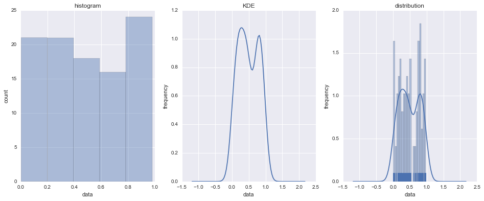
ax1.set_title('histogram')
ax2.set_title('KDE')
ax3.set_title('distribution')
# Plot histogram, KDE and all histogram/KDE/rug on three axes
sns.distplot(data, kde=False, ax=ax1)
sns.distplot(data, hist=False, ax=ax2)
sns.distplot(data, rug=True, ax=ax3, bins=20)
# Render three types of distribution plot with seaborn