Two variable continuous x and y in matplotlib and seaborn 
Introduction
This notebook exercise describes visualisation of two-dimensional continuous x,y data in Python, using the matplotlib and seaborn libraries.
For these examples, we will work with data concerning airline safety from the FiveThirtyEight blog post:
This data is located in the file data/airline-safety.csv, in the root repository. In this exercise you will look at the relationship between 'incidents' and 'fatalities' in the two 14-year periods: 1985-1999, and 2000-2014, to reproduce a figure from the blog post visualising the relationship. You will also carry out linear regression on the data and allowing you to determin whether there appears to be a (perhaps predictive) relationship between the two.
Python imports
To set up inline images, we run the magic:
%matplotlib inline
and we import seaborn and pandas into the namespaces sns and pd:
import seaborn as sns
import pandas as pd
To do regression later on, we import scipy.stats as stats:
from scipy import stats
import warnings
warnings.filterwarnings('ignore')
# Use the pylab magic and import seaborn
%matplotlib inline

import matplotlib.pyplot as plt

import seaborn as sns
import pandas as pd
from scipy import stats

# Suppress warnings
import warnings
warnings.filterwarnings('ignore')
Learning Outcomes
- Representing two-dimensional continuous x and y data using
matplotlibandseabornlibraries - Use of
figure()and subplots - Annotating plots with text
- Working with long and wide form
DataFrames inpandas - Using statistical overlays and
seaborn's statistical plots
Exercise
1. Loading the dataset
The data used for the FiveThirtyEight blog post was downloaded from https://github.com/fivethirtyeight. This describes for a set of airlines the number of seat kilometres flown every week, and corresponding counts for incidents, fatal accidents and fatalities for those airlines in the two 14-year periods 1985-1999 and 2000-2014.
FiveThirtyEightdata: https://github.com/fivethirtyeight
The data is saved under this repository's root directory in the data subdirectory, in comma-separated variable format, as airline-safety.csv. You can import this into a pandas DataFrame in the variable safety with:
safety = pd.read_csv("../../data/airline-safety.csv", sep=",")
pandas: documentation
and inspect it with a number of useful DataFrame methods:
safety.head()safety.describe()safety.dtypes
# Load the airline safety data into the variable safety
# Inspect the data set using this cell
2. Creating subplots
One of the more straightforward ways to gain a quick overview of continuous x, y data is with a scatterplot. In terms of elementary perceptual tasks, this places datapoints on a plane, with two common scales - one on the x-axis and one on the y-axis.
You will begin by drawing six subplots, in two rows of three:
- Row 1: incidents, fatal incidents and fatalities for 1985-1999
- Row 2: incidents, fatal incidents and fatalities for 2000-2014
Each subplot will contain a scatterplot, with x-axis equal to the number of seat kilometres flown, and the y-axis representing each of the datasets above.
Creating subplots and axis labels
There are several ways to create a subplot layout in matplotlib, and you may have seen some of these in the exercise one_variable_continuous.ipynb. Here, we will use the subplots() function. This returns a figure() object, and collections of subplots, nested by row. To get two rows of three subplots, retaining each of the six subplot object in a variable we can then manipulate (as ax1..ax6) you can use the following code:
fig, ((ax1, ax2, ax3), (ax4, ax5, ax6)) = plt.subplots(nrows=2, ncols=3, figsize=(12, 8))
Here, figsize takes a tuple of (width, height) for the figure, in inches.
# Create axes in this cell, with tight_layout()
The subplots can be referred to individually to set their properties. To assign common x-axis labels for example, you can create a variable axes that holds a list of the six axes, and then loop over them to apply individual x-axis labels:
axes = (ax1, ax2, ax3, ax4, ax5, ax6)
for ax in axes:
    ax.set_xlabel("km flown")
This modifies the axes in-place, but does not change images that have already been produced. To visualise the modified figure, use:
fig
# Set axes xlabels in this cell
You can pair up axes to write common y-axis labels, in a similar way. In the code below axes are paired in tuples that should have the same y-axis label, and associated (in another tuple) with the corresponding y-axis label. These tuples are then placed in the list ylabels. You can then loop over the list, to unpack the axes and the labels that need to be applied:
ylabels = [((ax1, ax4), 'incidents'),
           ((ax2, ax5), 'fatal incidents'),
           ((ax3, ax6), 'fatalities')]
for axes, label in ylabels:
    for ax in axes:
        ax.set_ylabel(label)
And to get nice separation of subplots in the grid layout so that the axis labels don't overlap, we can use fig.tight_layout() (and use fig to visualise the updated plot):
fig.tight_layout()
fig
# Set y-axis labels in this cell
CHALLENGE: Can you set subplot titles on each chart in the top row to read 1985-1999, and on each chart in the lower row to read 2000-2014?
# Complete the challenge in this cell
3. Plotting the data
So far all the plots are empty - there is no data associated with any of the axes. To examine relationships between incidents and fatalities, and the number of seat kilometres flown, you will have to add a data representation to each axis.
For this you will use the ax.scatter() method, to render a scatterplot on each axis. As you will need to place a different dataset on each y-axis, pairing axes with those specific columns in the dataset as (axis, data) tuples will be useful, and this is done by creating the variable datacols below:
datacols = [(ax1, 'incidents_85_99'), (ax2, 'fatal_accidents_85_99'),
            (ax3, 'fatalities_85_99'), (ax4, 'incidents_00_14'),
            (ax5, 'fatal_accidents_00_14'), (ax6, 'fatalities_00_14')]
Each of the datasets will be plotted against the same x-axis data - so you can loop over the six axes, calling the .scatter() method on each, and passing the same x-axis data (safety['avail_seat_km_per_week']) each time, varying the y-axis data (safety[col]) for each axis.
for ax, col in datacols:
    ax.scatter(safety['avail_seat_km_per_week'], safety[col])
# Plot the data in each scatterplot
From these scatterplots you should see that the overall relationship is consistently that the more miles are flown by an airline, the more incidents of any type tend to occur. Also:
- there is a strong outlier in 1985-1999 for number of incidents per seat km flown.
- the number of fatalities does not appear to correlate strongly with km flown
- the number of fatal incidents is small for any given airline - especially in the period 2000-2014
4. Long and wide form data, faceting
The six plots above suggest that a statistical summary plot might be useful, fitting a linear regression to each of the six subplots. You can do this using the specialist plot type lmplot() in seaborn, to replace the matplotlib.scatter() plots we drew above.
There's one slight niggle with this approach - we have to reconfigure our safety data, casting it from wide to long format, so that we can use a method called faceting to produce a grid of one subplot per variable type.
You can do this with pd.melt(), a pandas function that can 'melt' data into a long table where variable names are placed in a single column, and the values for those variables are placed alongside in the same row.
Melting data
Melting data works much like pivot tables (which you may know from Microsoft Excel). In essence, you need to assign each of the data columns in your DataFrame to one of two types: id_vars or value_vars. These are conceptually distinct from each other, and to understand them it helps to consider a DataFrame as a specific kind of data structure...
In wide form, each row of a DataFrame represents an individual, distinct datapoint; the columns of a wide DataFrame can be considered to represent variable values, and the names of those variables are given in the column headers. Those variables can be either id_vars, or value_vars.
In long form, datapoints are represented in multiple rows: each datapoint has one row per value_var. Rows corresponding to the same datapoint are united by having the same id_var (or multiple id_vars).
The airline data can be divided into these groups sensibly as follows:
id_vars: these are values that are used to identify a datapoint (airline) or it is otherwise useful to associate it with the same datapoint in each row - like a common x-axis value (avail_seat_km_per_week)value_vars: all the other columns
You can create a new DataFrame in long format as safety_long with the code below:
safety_long = pd.melt(safety, id_vars=['airline', 'avail_seat_km_per_week'],
                      value_vars=['incidents_85_99', 'fatal_accidents_85_99',
                                  'fatalities_85_99', 'incidents_00_14',
                                  'fatal_accidents_00_14', 'fatalities_00_14'])
This converts the data from a $56 \times 8$ to a $336 \times 4$ DataFrame. You can inspect the changes with:
- safety_long.head()
- safety_long.describe()
- safety_long.dtypes
# Melt the data into long form and inspect the output in this cell
Now you can use sms.lmplot() to render six scatterplots from the long form DataFrame - one for each variable in the order they were given in value_vars above: ['incidents_85_99', 'fatal_accidents_85_99', 'fatalities_85_99', 'incidents_00_14', 'fatal_accidents_00_14', 'fatalities_00_14'] - with overlaid linear regression on each plot.
sms.lmplot(): docs
You will need to set the x, y data, and the originating dataset as:
x:'avail_seat_km_per_week'(common to all plots)y:'value'(the data value for each variable)data:safety_long(the originating DataFrame)
You can split/facet the plot into six subplots on the basis of the six variables, by setting the following:
col:'variable'(split into separate plots on the basis of the variable names)hue:'variable'(colour each variable plot differently)col_wrap:3(wrap each row at three plots, so we get a 2x3 grid)
Finally, as the y-axis values vary greatly between the six plots, you can relax the default setting that they share y-axes:
sharey:False
So the line that generates our faceted grid plot is:
sns.lmplot(x='avail_seat_km_per_week', y='value', data=safety_long,
           col='variable', hue='variable', col_wrap=3, sharey=False);
# Create the faceted lmplot in this cell
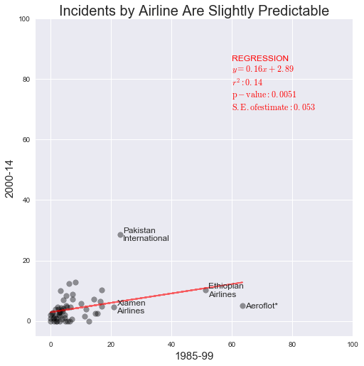
5. Reproducing the blog plot
The original blog post focuses on whether the number of incidents per airline in 1985-1999 is predictive of the number of incidents per airline in 2000-2014. We will attempt to emulate the plot of incidents per airline in each time period:

Adjusting the data
The first thing to note is that the incident data are normalised per 1e9 seat km, which is a sensible measure, and was suggested by our scatterplots above. You can generate two new DataFrame columns in safety to hold this data:
safety['x_norm'] = 1e9 * safety['incidents_85_99']/safety['avail_seat_km_per_week']
safety['y_norm'] = 1e9 * safety['incidents_00_14']/safety['avail_seat_km_per_week']
# Normalise data in this cell
Next, you can fit a linear regression to this data using the scipy.stats.linregress function, to capture some information about the fit:
slope, intercept, r_value, p_value, std_err = stats.linregress(safety['x_norm'],
                                                               safety['y_norm'])
This returns several useful regression values that you will add to the plot later.
# Fit a linear regression to the normalised data
Now you need to create a new figure() with axes, on which you can plot firstly a line that represents the linear regression fit (in red), and then the normalised data points for each airline's incidents per seat km travelled:
fig, ax = subplots(figsize=(8, 8))
ax.plot(safety['x_norm'], fit[0] * safety['x_norm'] + fit[1], c='red', alpha=0.6)
ax.scatter(safety['x_norm'], safety['y_norm'], s=60, alpha=0.4, c='black')
Next, set labels and x and y axis limits to match the blogpost, and square up the aspect ratio with `ax.set_aspect('equal'):
ax.set_xlabel('1985-99', fontsize=15)
ax.set_ylabel('2000-14', fontsize=15)
ax.set_title('Incidents by Airline Are Slightly Predictable', fontsize=20)
ax.set_xlim((-5, 100))
ax.set_ylim((-5, 100))
ax.set_aspect('equal')
# Plot the figure in this cell:
# Plot regression line and scatterplot

# Add labels and set aspect ratio
This corroborates the modest positive correlation that is reported in the blog, but we have yet to identify and label "outliers" on the plot.
Firstly, you will identify all points with more than 20 incidents in the period 1985-1999, placing them in the DataFrame outliers, by filtering the safety DataFrame:
outliers = safety.loc[safety['x_norm'] > 20,]
outliers
# Identify outliers with more than 20 incidents in 1985-99
Now you need to to add text for each of the airlines in these table rows, at the x,y position corresponding to their datapoints. To do this, iterate over each row in outliers in turn - using the .itertuples() method to get the data in tractable form - noting that 'x_norm' and 'y_norm' are in columns 9 and 10, respectively. The airline name is in column 1.
The code below does some formatting on the fly - replacing spaces in airline names with \n - a line feed - using the .replace() string method to get some neater text formatting.
To avoid confusion/interfering with x and y variables, the code uses x_lbl and y_lbl to be clear that it's talking about label coordinates, and to avoid modifying data in variables x and y.
Within in the loop, the label text to the scatterplot for each airline, using ax.annotate(). The code below sets the fontsize to be a little larger than default, and aligns the text at its centre point vertically with the datapoint, for neatness. It also offsets the x-axis position of the text by 1 to avoid direct overlap.
for row in outliers.itertuples():
    x_lbl = float(row[9])
    y_lbl = float(row[10])
    label = str(row[1]).replace(' ', '\n')
    ax.annotate(label, (x_lbl + 1, y_lbl), fontsize=12,
                verticalalignment='center')
# Annotate the outliers and render the figure
To take the figure slightly beyond that in the blog, you can add information about the regression to the upper right quadrant (which currently looks a bit empty), again using ax.annotate().
The code below creates a list of strings, one per line in the final annotation text, which are joined by line feeds with the idiom \n.join(['str1', 'str2', ...]).
matplotlib allows $\LaTeX$ strings, which are indicated here enclosed in $, as inline $\LaTeX$ strings. The code below also uses the string.format() idiom from Python, to format floating point numbers with a suitable number of decimal places.
annotstr = '\n'.join(['REGRESSION',
                      '$y = {0:.2f}x + {1:.2f}$'.format(slope, intercept),
                      '$r^2: {0:.2f}$'.format(r_value**2),
                      '$\mathrm{{p-value}}: {0:.4f}$'.format(p_value),
                      '$\mathrm{{S.E}}. of estimate: {0:.3f}$'.format(std_err)])
ax.annotate(annotstr, (60, 70), fontsize=12, color='red')
# Add text describing the regression, in this cell
QUESTION: Would this regression data be better presented as a table?